Redesign of mobile
campus information app
Tufts Mobile is a free app that in its current state provides information to students and anyone who wants to connect to Tufts University. Tufts Mobile is meant to aggregate the university's resources and information into a simple and effective app.
These include:
Student profiles and directory
Access to health services and fitness center
Real-time GPS tracking of Tufts shuttles and parking access
Location and directions on Tufts campuses
Dining services and mobile ordering
Official social media feeds
Access to university libraries
Alerts and closings- notifications
Student support and sexual misconduct report
Sustainability initiatives
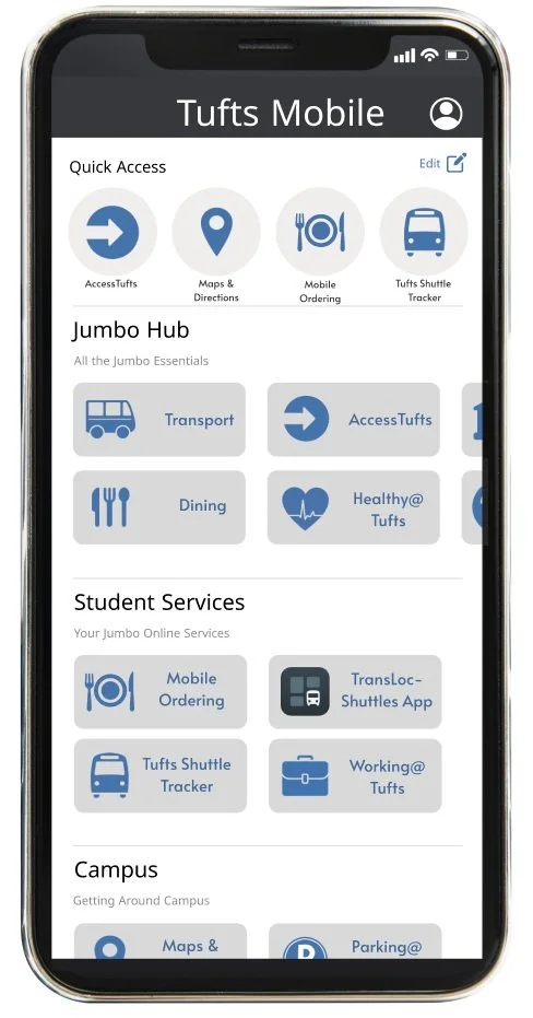
Final Redesigned App Layout
Interviews With Target Audience:
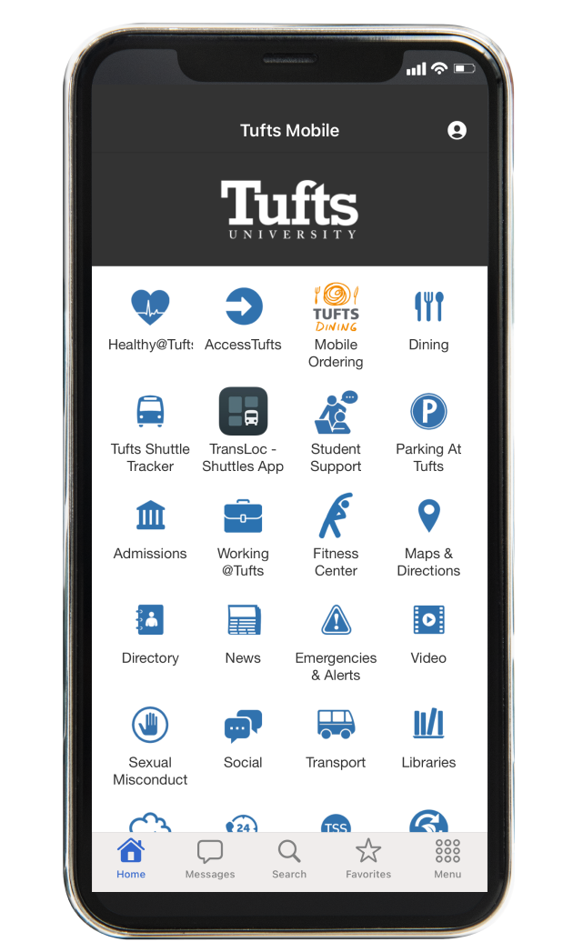
“Busy and doesn’t work” “Overwhelming” “Layout feels very cluttered” “Too much at once”
Problem takeaways:
Too much on the screen with no mapping or sectioning of the different applications
Requires users to look through every icon to find the application they want to use
The goal is to give a simple app for students to use to find the different services that the school offers, yet the app is needlessly unorganized and therefore makes it complicated to find the actual services
Some pages are not utilized and their features are therefore somewhat ignored and unused
Current Design of Tufts Mobile App
Comparative Analysis - Learning from others
App Store Games
Rochester Institute of Technology Mobile App
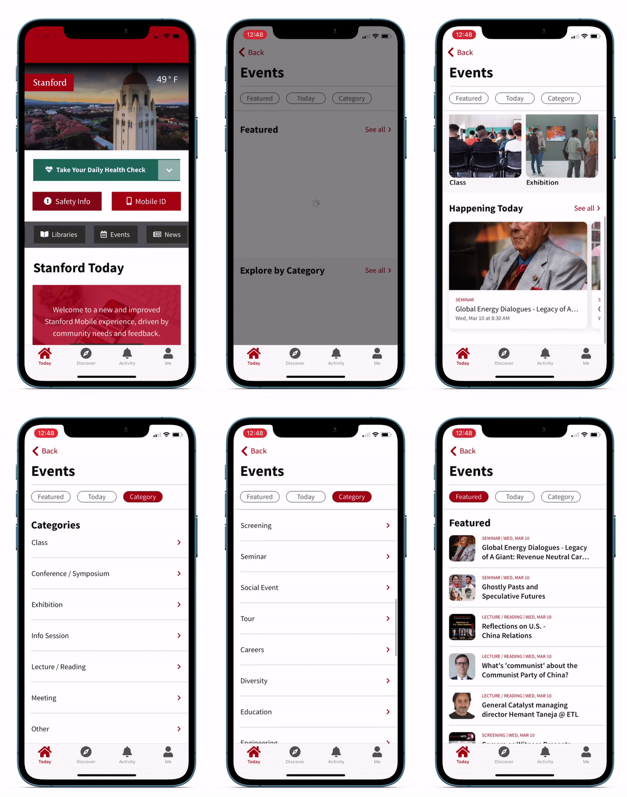
Stanford Mobile App
Takeaways:
Takes a collection of different application icons and organizes them in a way that is easily navigable and effective. Looks and feels modern, and gives a much more updated and innovative impression to users
College students will be the main demographic of users and will be especially used to the Apple app-inspired UI design
A section on top for most used apps: The apps that are most likely to be used are on top. The user should have the choice to select what they most commonly use and find it easily every time
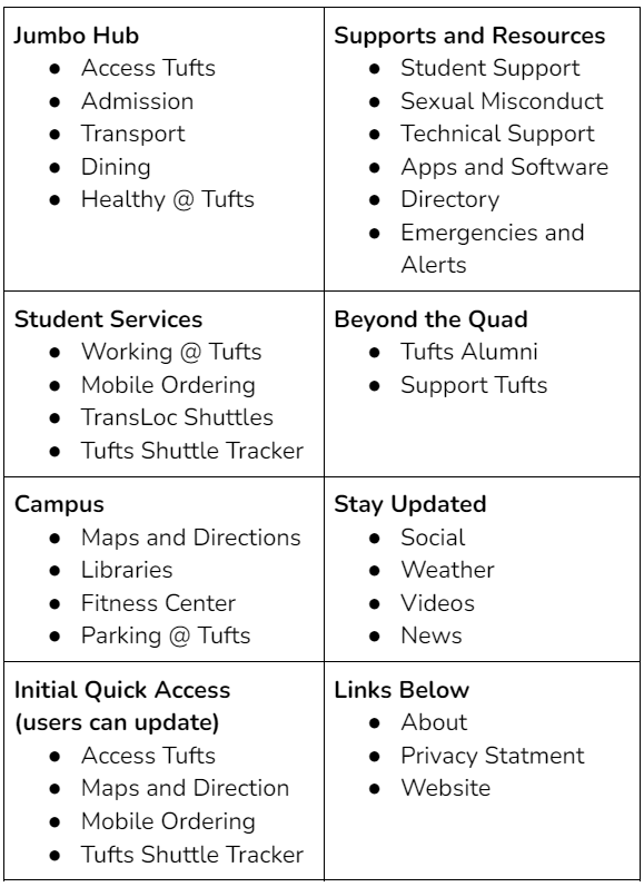
Grouping applications with short descriptions allows users to quickly skim the different titles of groups to find the type of app that they want. Apps are organized and grouped based on similar qualities
Showing cut-off app icons tells users that there are more apps available to look at without using clutter-inducing signifiers. Users don’t feel overwhelmed by the number of apps on the screen at once
Ideation and Prototyping
Grouping Applications in Tufts Mobile
Low Fidelity Sketch
Final Design
Explanation of the Design
The quick access icons use a slightly lighter grey color and a circle icon to differentiate and indicate that these icons are not grouped by the same qualities as the darker grey icons
The “Edit” button in the top right will bring users to an intermediate screen that shows all the options and allows users to choose which 4 apps they want as their quick access tab
Each group includes a prominent title along with a quick description of the group in a smaller text style to inform, but not overwhelm the user
Clear lines separate the different groupings further emphasizing how each collection represents different purposes and resources
The cutoff icons use the built-in schema the user has already from the Apple store, where they are alert to the idea that they must swipe to see the other cutoff icons and to click them
Purposefully simple Tufts-inspired color scheme and limited text with the direct goal of limiting the amount of distracting elements and limiting overstimulation


