Hi, I’m Kabir!
I’m a Mechanical Engineering student, graduating from Tufts University in 2027, focused on assistive technology, robotics, and human-centered design. I put a lot of value in being heuristically capable, keeping my skills broad across programming, dynamics, 3D modeling, prototyping, and testing as well as research, design, and client-facing work. I want to use that range to build things that actually help people, whether that is a product that directly assists someone or a system that makes a process work better for the people using it.
Projects

Mobile App Redesign For University Students

Website Page Redesign For Age-Tech Company

Neurodivergent Assistant: Accessibility Tool
Research Paper: Color Perception in Product Design
Additional Robotics Course Projects
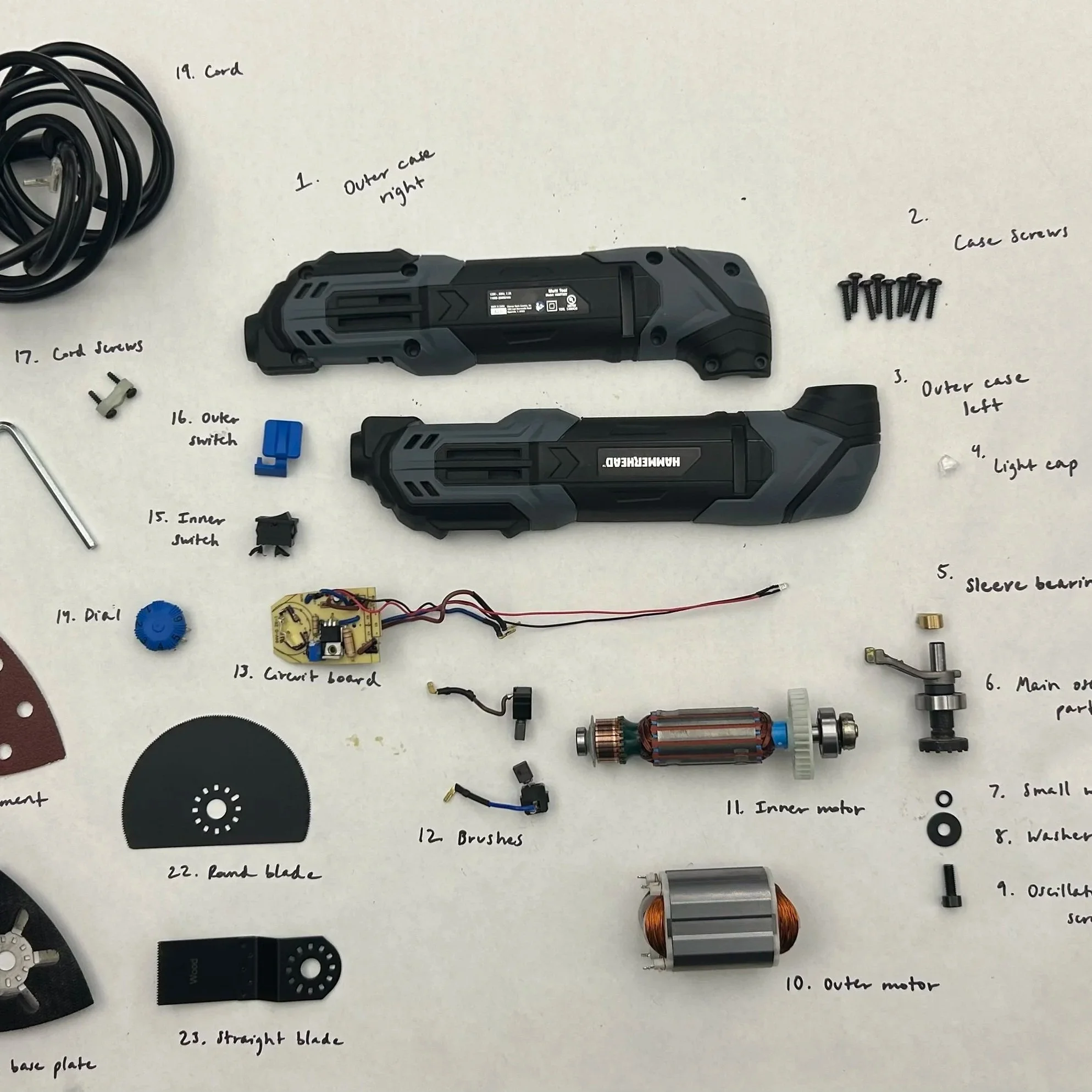
Oscillating Multi-Tool: Teardown and Analysis
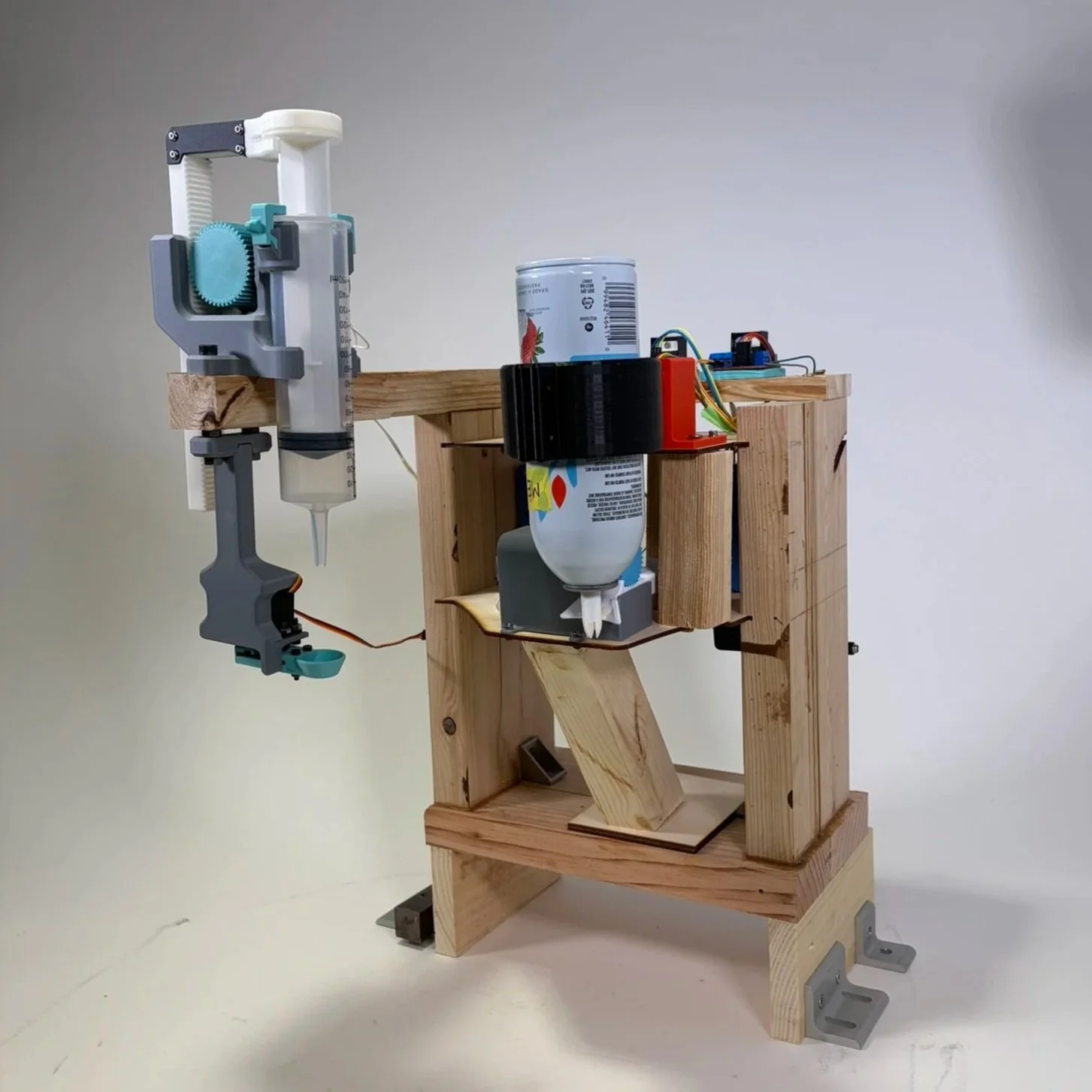
WAFFLE LAB: Automated Topping Station
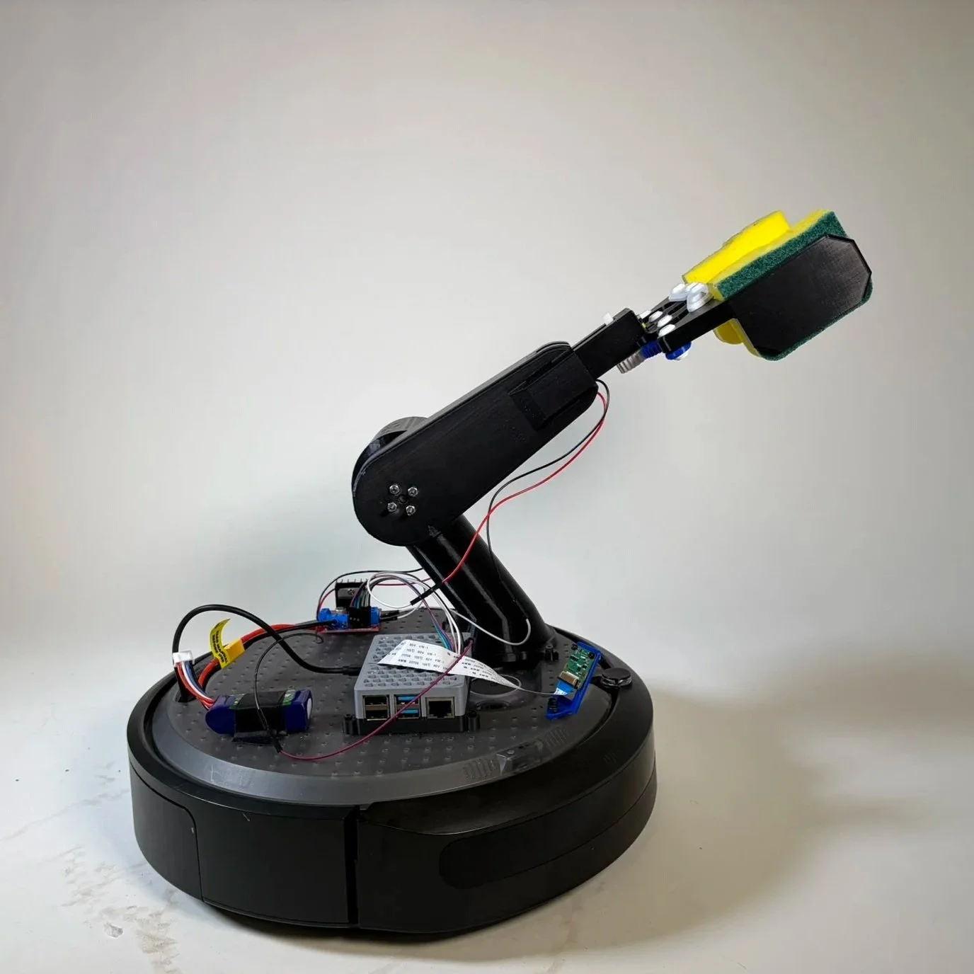
Object Recognition Grabbing Robot
Skills Include:
Design Thinking & Communication
Various Design Process’
Microsoft Office
Google Suite
UX & UI Research
User Research
Prototyping
Figma
Adobe Creative Suite
Model Making
AutoCAD
Autodesk Inventor
SolidWorks
Onshape
Laser / Water Jet Cutting
Sand Casting and Metal Working
Woodworking
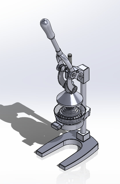
Made in SolidWorks
Computing Tasks
Raspberry Pi
GoPiGo3
Java Script
C++
Python
MATLAB
Artificial Intelligence
Adobe Firefly
DALL-E
Midjourney
Galileo
ChatGPT- prompt engineering
Claude coding and research